App Modernization
Enterprise ordering moved off phone calls and email threads into one Android app that non-technical buyers and sellers can use.
Overview
OrderDesk is an Android app that digitizes enterprise order management. Before it, orders were placed over the phone, catalogues went out by email, and tracking and price negotiation happened in email threads. We designed one app where people place, track and manage orders, simple enough for users who are not comfortable with technology.
The real problem
Enterprise order management was completely manual. Orders were placed and received over phone calls, catalogues were sent by email, and order tracking and price negotiation also lived in email.
The people doing this work were not tech-savvy. A digital tool would only replace the phone if it felt simpler than picking up the phone.
What good looked like
- Ordering, tracking and catalogues in one place
- Simple enough for non-tech-savvy users
- Test the concepts with users before high-fidelity design
How I solved it
Open questions, then structure
We started with open-ended questions, then moved to planned research: interviews, surveys and one-to-one sessions with users and domain experts, empathy maps, and a look at competitors, both global and local. The detailed findings stay private under an NDA.
Users mapped to needs
We grouped the user base, then mapped each group to its pain points, expectations and the features it wanted. Enterprise business scenarios were indexed against those groups.
Epics and personas
Every action a user can take became an epic with its own design story. A prioritized list of epics, combined with a persona for each target group, defined the scenarios the app had to handle.
Task flows to wireframes
Key actions became user task flows: log in, search, forms, menu and profile. We moved from hand-drawn, low-fidelity wireframes to sketch-based high-fidelity wireframes we could put in front of users.
Tested before pixels
A/B tests compared options for exploring, browsing and placing orders, measuring ease of use and findability. Usability tests gave users a basic task list and measured task completion rate and time on task.
What I designed
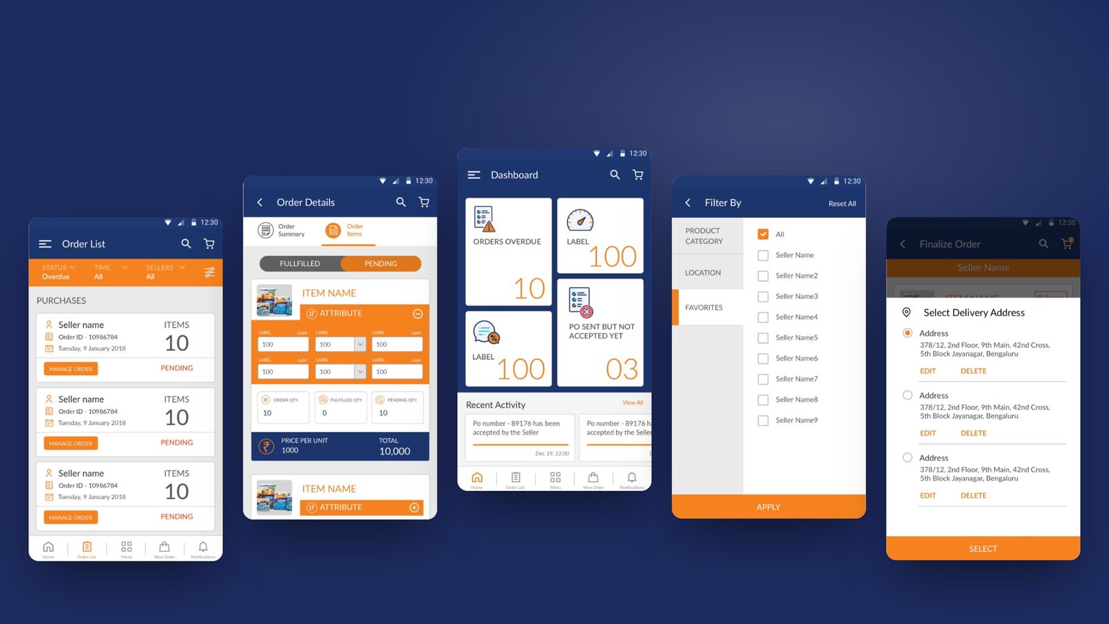
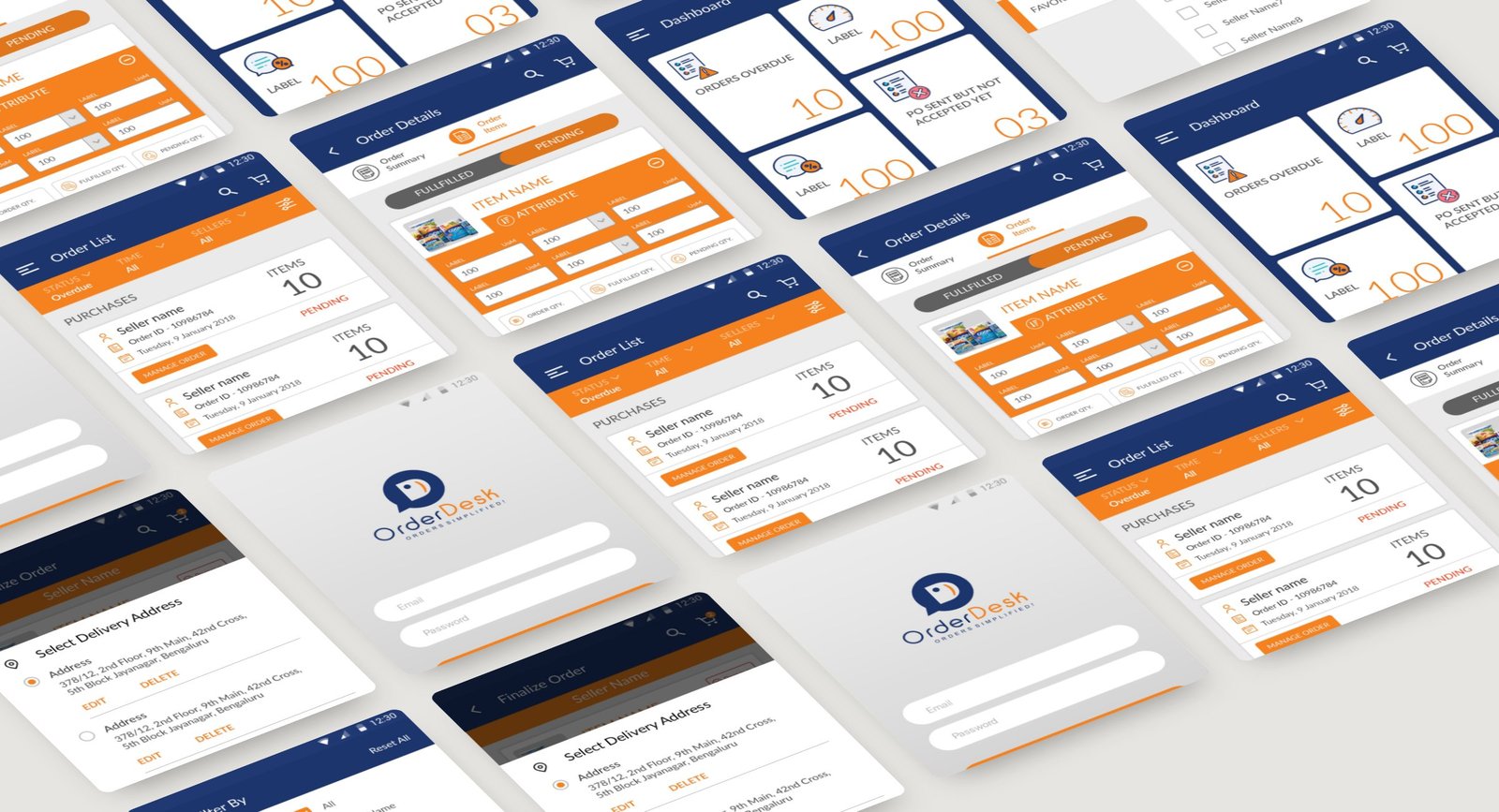
Dashboard at a glance
Overdue orders, purchase orders still waiting on the seller, and recent activity on the first screen.
Order list and details
Every order with its status, items and totals, filterable by status, time and seller.
Simple filters
Filter by product category, location or favourites, then one Apply button.
Checkout in the app
Choose a saved delivery address and finalize the order without a call.
Key decisions
- Test at the wireframe stage: low-fidelity tests were cheap and found usability problems before any high-fidelity work.
- Lead with what needs attention: the dashboard opens on overdue and pending orders, not on a menu.
- Fabric for analytics, because the team already had experience with it.
Outcome
- The final wireframes became detailed high-fidelity mockups with real content, handed off to developers on Zeplin
- After launch we tracked onboarding, time to complete key flows and task completion rates in Fabric
- Next on the roadmap: logistics and payment features, and order management access for privileged users
What I learned
Cheap, low-fidelity tests with real users shaped the app more than any polished mockup could.
Credits
- Role
- UI/UX designer
- Company
- Client work (under NDA)
- Year
- 2018
- Platform
- Android
- Built with
- Zeplin, Fabric
Got a project?
let's talk
Bringing AI into your team's workflow, or designing a product people love? Let's find the real problem first.
Get in touch